You edited your picture perfectly. It shines, the shadows are full, the colors pop. Satisfied, you export it and send it to your smartphone or printer. But then the shock: on the phone it looks dull, and the expensive wall print drowns in black. Did darktable make a mistake?
No. The problem is not in the software, but in your perception. In this article, we will explain why your eyes are deceiving you and how to set up your workspace so that “white” really remains “white”.
1. The Basis: Your Monitor Lies (Probably)
Most monitors are set far too bright from the factory. This looks great in the electronics store, but it’s fatal for image processing.
- The problem: If your monitor shines at 100% brightness (often 300-400 cd/m²), you unconsciously edit your pictures darker so they don’t dazzle you.
- The consequence: The image then lacks light on any normal device (or in print). It looks underexposed.
- The solution: Dramatically reduce the brightness of your monitor. For normal rooms, a value of 100 to 120 cd/m² is recommended. For many monitors, this corresponds to a setting of 20-30% brightness!
Tip: A colorimeter (e.g., Datacolor Spyder or X-Rite) is mandatory for serious work at some point. It not only measures the colors but also helps you set the correct brightness.
2. The Dictator: Ambient Light
Your eye is not a fixed measuring device; it constantly adapts to the environment. This is called “chromatic adaptation”.
Scenario A: The Darkroom
You sit in a completely dark room in the evening. Your monitor looks extremely bright. You lower the exposure in the picture.
Result: The picture becomes too dark.
Scenario B: The Sunlit Window
The sun is shining right into the room. Your monitor looks dull and dark in comparison. You increase contrast and brightness.
Result: The picture is blown out.
The practical solution: Ensure constant, dimmed room light. No direct light on the monitor, no direct sun in your field of view. Professionals use standard light lamps for this, but a good LED lamp that does not shine directly on the screen is a good start.
3. The Trap of Dark Themes
We love dark themes. They look professional, protect the eyes, and do not distract. Lightroom, Capture One, and our own Pro Themes also use almost black backgrounds.
But be careful: The eye can be deceived (simultaneous contrast).
- One and the same gray appears brighter on a black background than on a white background.
- If you use a very dark theme, you subjectively perceive your photo as brighter and higher-contrast than it actually is.
- As soon as you look at the image on a white website (e.g., a news page), it suddenly looks dull and dark.
The “Reality Check” in Darktable
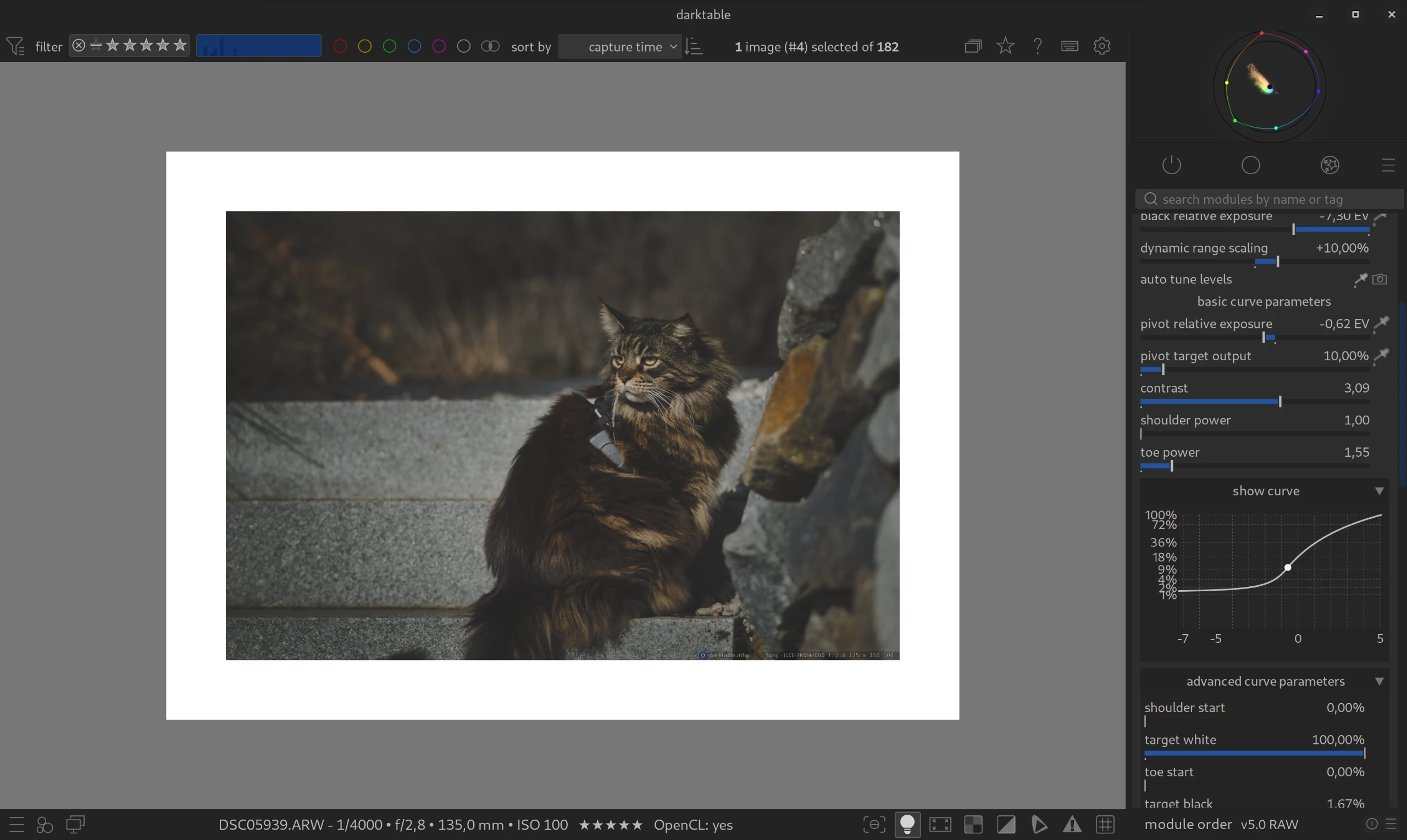
So do you have to use a bright theme? No! But you must ask darktable to show you the truth before you export.
Use the Color Assessment Mode (ISO 12646).
- Click on the light bulb icon at the bottom right (or press
Ctrl+B). - Darktable shows a white frame around your image.
- If your picture suddenly looks “dirty” or too dark: Correct the exposure (usually +0.3 to +0.5 eV) until it holds up against the bright white.
4. The Target Medium Decides
An image can rarely be perfect for all media at the same time. You have to decide:
| Target Medium | Special Feature | Hint |
|---|---|---|
| Social Media / Mobile Phone | Displays are very bright, high-contrast, and colorful. | Here the picture can be “crisp”. Always export to sRGB. |
| Websites (bright) | On a white background, shadows appear black faster. | Pay attention to good detail in the shadows. Use the Color Assessment Mode! |
| Print (Paper) | Paper does not emit light! It only reflects light. | An image for printing often has to appear too bright and too flat on the monitor to look correct when printed. Use “Softproof” (icon in the bottom left). |
5. The Smartphone Paradox: “But everyone has bright displays!”
You might be wondering now: “Why should I dim my monitor when everyone uses an iPhone with a super bright OLED display today?”
This is a logical objection, but a trap lurks here:
Whoever edits brightly delivers darkly.
- If your monitor is extremely bright, you perceive your image as radiant. So you will tend to reduce the exposure a bit.
- The result: It looks good on your “floodlight monitor”. But on any other device (laptop in energy-saving mode, cheap office monitor, tablet in the evening), the picture is way too dark and the shadows drown.
The strategy for social media:
Stay on your calibrated, moderate monitor (120 cd/m²) as a reference. This is your “safe haven”. But if you’re exporting specifically for Instagram or Web, you’re allowed to push the histogram a little more boldly to the right (“Expose to the Right”) than you would for an art print.
The final check: Send the picture to your phone before posting. If it looks good there with medium brightness, you did everything right.
Summary: Checklist for the Right Brightness
- Dim Monitor: Lower the brightness (target: approx. 100-120 cd/m²).
- Room Light: Avoid direct sun and complete darkness.
- Trust the Histogram: Your eye is lying, not the histogram. Make sure that the midtones (the “mountain”) are in the middle or slightly to the right.
- The Reality Check: Press
Ctrl+Bbefore export. Does your picture hold up against the white frame? If yes -> Export!
January 27, 2026