December 20, 2025
Color Balance RGB is your central tool for saturation, color grading, and contrast.
In the modern workflow, this single module replaces almost all old color sliders. It works in the linear RGB color space, which means: It behaves physically correctly and creates cleaner transitions than old tools.
The Most Important Tabs
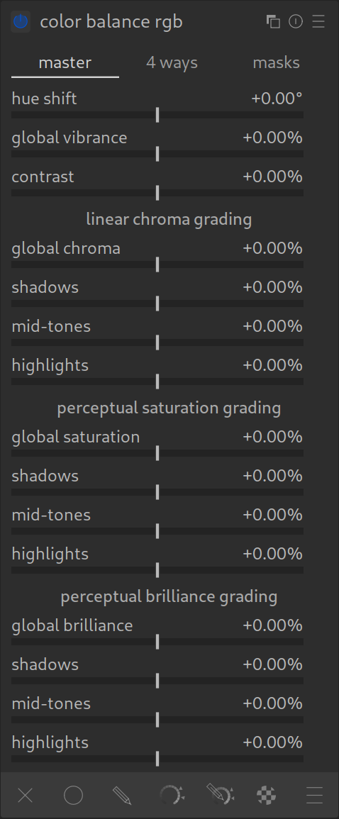
1. “Master” Tab
Here you make global adjustments. At the very top, you will find the three main sliders:
- 1. Hue Shift:
- This slider rotates all colors around the color wheel. Red becomes orange, blue becomes purple, etc.
- Recommendation: Leave this slider at 0 most of the time, unless you want to correct a general color misinterpretation by your camera (e.g., purple skies).
- 2. Global Vibrance:
- The most important slider for more color! It is “intelligent”: It mainly boosts pale colors and protects skin tones as well as already saturated colors.
- Tip: Almost always use this slider instead of standard saturation.
- 3. Contrast:
- Increases global contrast. Since this happens after tone mapping, the effect is very strong (“punchy”). Use it sparingly for the finishing touch.
Further down in the “Master” tab:
Here you find sections for “Linear Chroma Grading” and “Perceptual Saturation”.
- These are alternative methods to increase saturation (mathematically harder or perception-based). For the beginning, Global Vibrance at the top is usually sufficient.
2. “4 Ways” Tab – For Color Grading

Here you can color shadows, midtones, and highlights separately (Color Grading).
- Shadows (Lift): Color the dark areas (e.g., slightly teal/blue for the cinema look).
- Highlights (Gain): Color the bright areas (e.g., orange/yellow for warmth).
- Midtones (Power): Affects the middle brightness range.
Operation:
- You see colored dots. Drag the dot towards the color you want.
- Pro Tip: Ctrl+Click on the color picker next to a slider automatically neutralizes a color cast (sets the complementary color).
3. “Masks” Tab
Here you define exactly what counts as “shadows” or “highlights”.
- The curves show you which brightness range is affected.
- The default settings usually fit well. You only need this tab if your color grading (e.g., in the shadows) bleeds too much into the midtones.
Summary
- Use Global Vibrance (2nd slider in the first tab) for natural colors.
- Use the 4 Ways tab to give the image a look (Color Grading).
- This is usually the last module in your processing chain.
Practical Tips for Color Balance RGB
- Use Multiple Instances:
Don’t hesitate to use multiple instances of this module! A common workflow is:- One instance for basic corrections (e.g., global saturation and contrast).
- A new instance (right-click on the multi-instance icon) specifically for Color Grading (e.g., to tint shadows blue and highlights orange), possibly combined with masks.
So keeps technical corrections and creative looks cleanly separated.
- Experimentation Encouraged:
This module is extremely robust. It is perfect for playful experimentation (“playing around”). If you don’t like a look, simply reset the module. Since it works in the modern workflow, you won’t “break” anything or lose image information as long as you stay within reasonable limits.
